Hey Daisy Dink community! ![]()
![]()
We recently gathered some initial feedback on our FOCUS, FORCE, and FUSION paddles and wanted to open the discussion to you! Your insights will directly influence our final designs, and we want to hear what YOU think.
Here are some key takeaways from our first round of feedback:
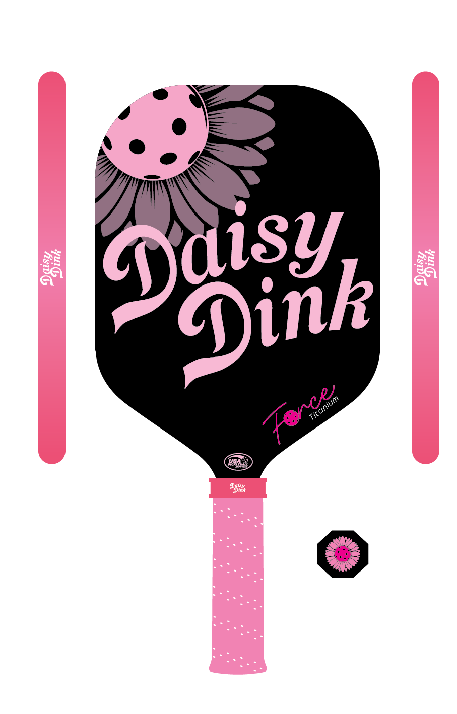
![]() The black & pink design is a favorite – It provides strong contrast, making the logo and design pop.
The black & pink design is a favorite – It provides strong contrast, making the logo and design pop.
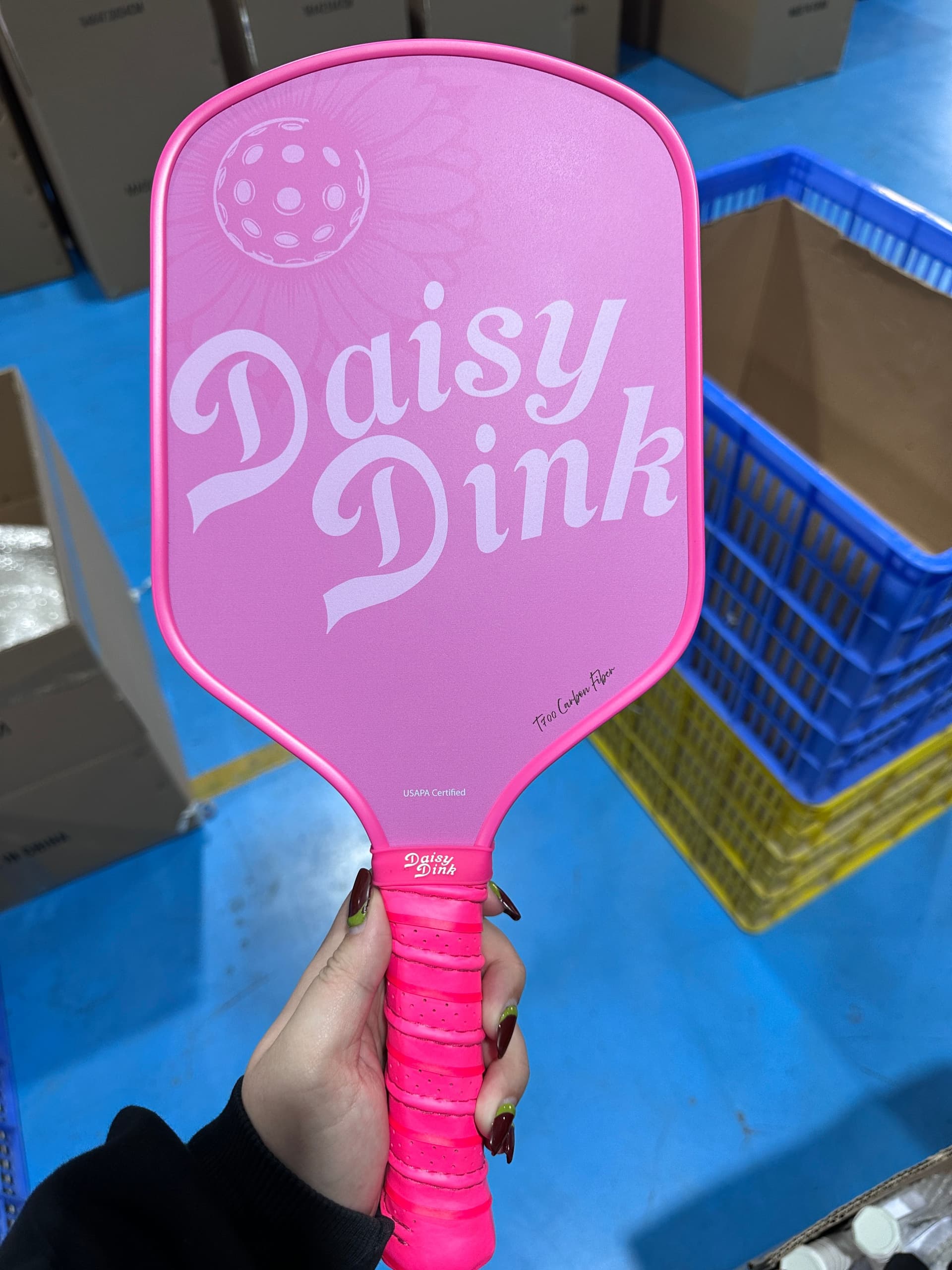
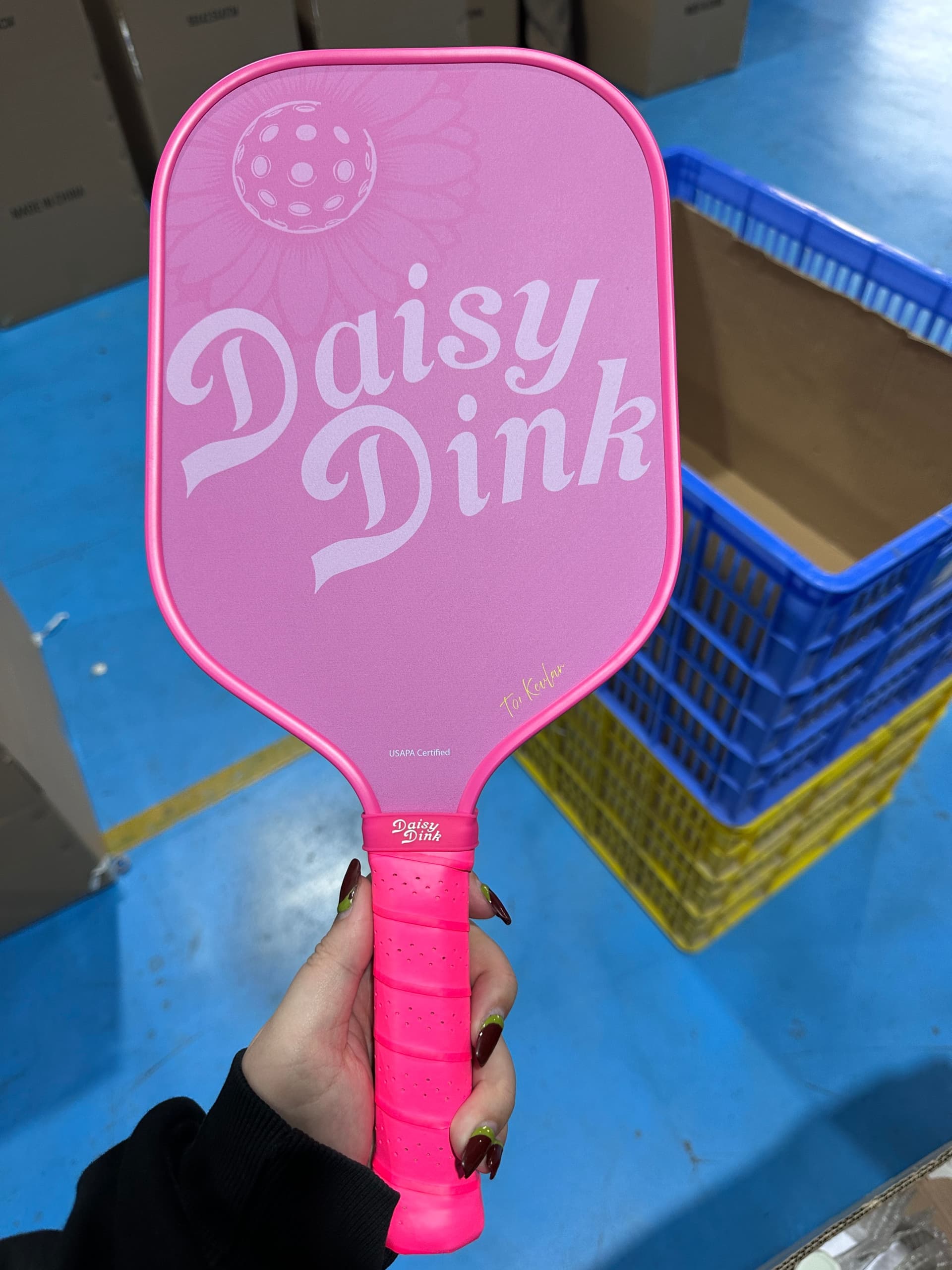
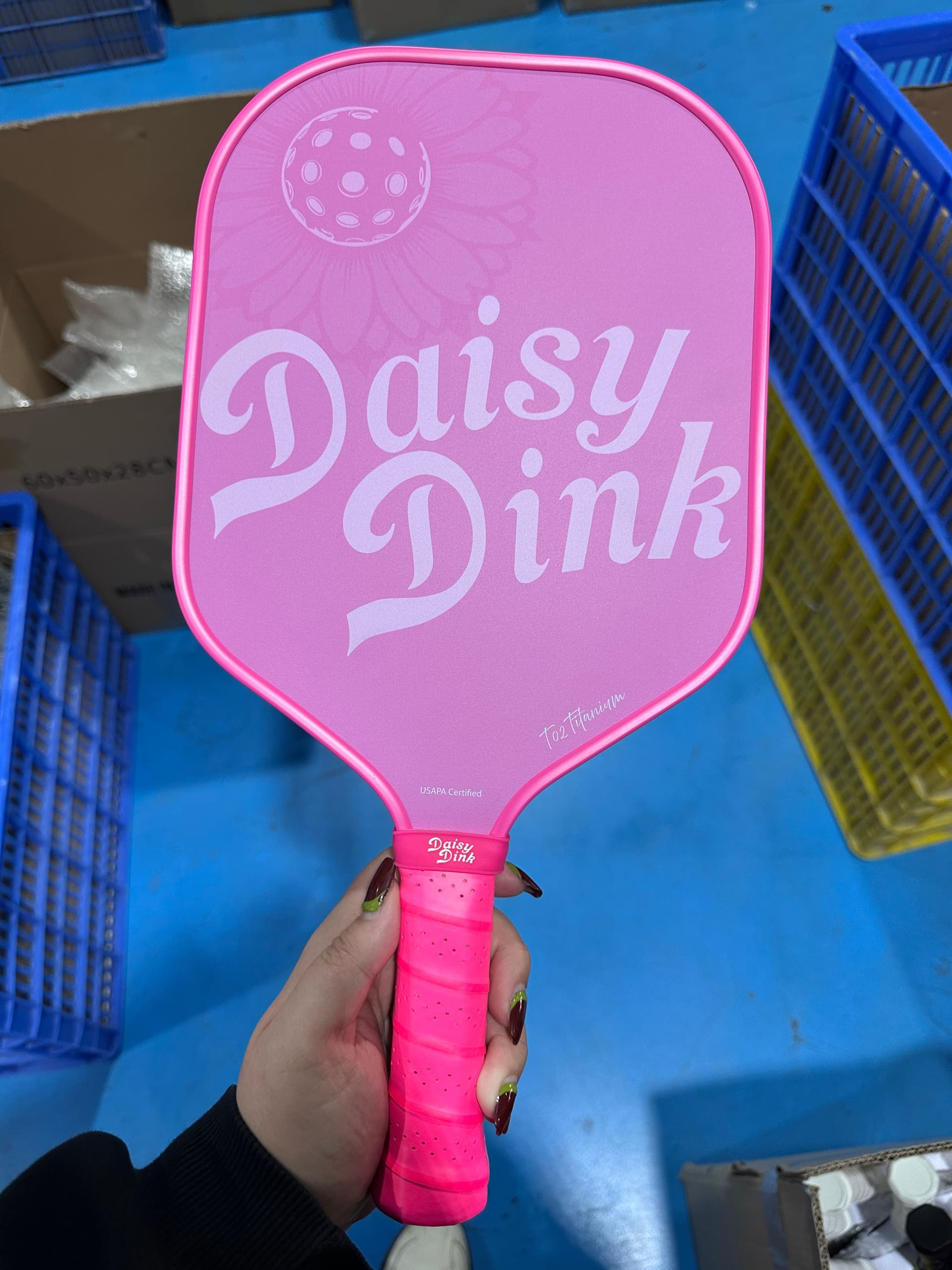
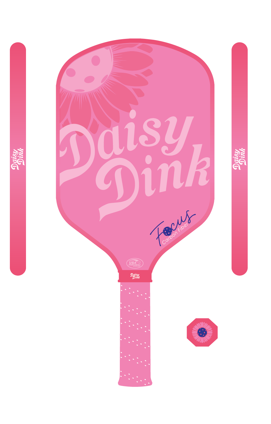
![]() Some feel the all-pink design lacks contrast – Should we outline the text or adjust the tones?
Some feel the all-pink design lacks contrast – Should we outline the text or adjust the tones?
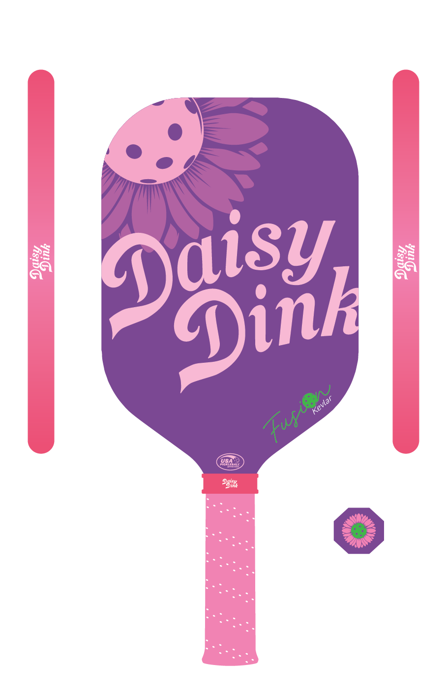
![]() Purple is hit or miss – Some love it, others think it needs more contrast or a different secondary color.
Purple is hit or miss – Some love it, others think it needs more contrast or a different secondary color.
![]() Logo placement & size opinions are mixed – Some prefer a minimalist look, while others love the bold branding.
Logo placement & size opinions are mixed – Some prefer a minimalist look, while others love the bold branding.
Your Turn!
We’d love for you to expand on these points and add fresh insights! Let’s discuss:
![]() Which paddle design do YOU like the most, and why?
Which paddle design do YOU like the most, and why?
![]() Which one is your least favorite, and how would you improve it?
Which one is your least favorite, and how would you improve it?
![]() What colors, patterns, or design elements would you love to see in future paddles?
What colors, patterns, or design elements would you love to see in future paddles?
![]() Does the current branding feel premium and distinct?
Does the current branding feel premium and distinct?
Your feedback matters—we’re co-creating something special together! Drop your thoughts below and let’s make Daisy Dink paddles the best on the market. ![]()
![]()